Pie chart is drawn using the pie() function in R programming . This function takes in a vector of non-negative numbers.
# create a named vector 'expenditure'
expenditure <- c(Housing = 600, Food = 300, Cloths = 150, Entertainment = 100, Other = 200)

# print the 'expenditure' vector
print(expenditure)
Output
Housing          Food        Cloths Entertainment         Other
          600           300           150           100           200
Let us consider the above data represents the monthly expenditure breakdown of an individual.
Example: Simple pie chart using pie()
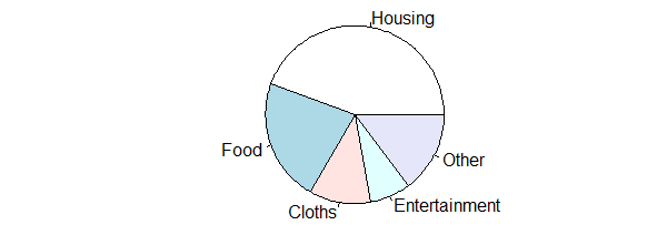
Now let us draw a simple pie chart out of this data using the pie() function.
pie(expenditure)

We can see above that a pie chart was plotted with 5 slices. The chart was drawn in an anti-clockwise direction using pastel colors.
We can pass in additional parameters to affect the way the pie chart is drawn. You can read about it in the help section ?pie.
Some of the frequently used ones are, labels-to give names to slices, main-to add a title, col-to define colors for the slices and border-to color the borders.
We can also pass the argument clockwise=TRUE to draw the chart in clockwise fashion.
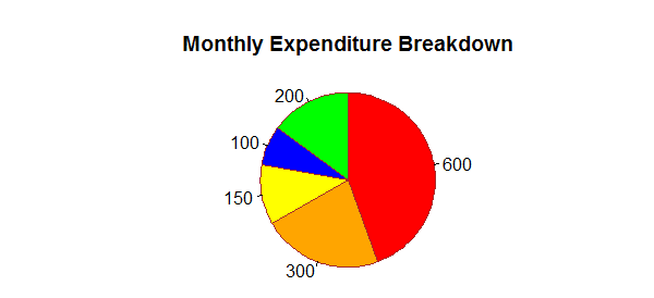
Example 2: Pie chart with additional parameters
pie(expenditure,
labels=as.character(expenditure),
main="Monthly Expenditure Breakdown",
col=c("red","orange","yellow","blue","green"),
border="brown",
clockwise=TRUE
)

As seen in the above figure, we have used the actual amount as labels. Also, the chart is drawn in clockwise fashion.
Since the human eye is relatively bad at judging angles, other types of charts are appropriate than pie charts.
This is also stated in the R documentation – "Pie charts are a very bad way of displaying information."
"The eye is good at judging linear measures and bad at judging relative areas. A bar chart or dot chart is a preferable way of displaying this type of data."