Sometimes we need to put two or more graphs in a single plot. The most common way to create multiple graphs is using the par() function to set graphical parameters.
R par() function
We can put multiple graphs in a single plot by setting some graphical parameters with the help of par() function.
R programming has a lot of graphical parameters which control the way our graphs are displayed.
The par() function helps us in setting or inquiring about these parameters. For example, you can look at all the parameters and their value by calling the function without any argument.
par()
Output
[1] FALSE
...
$yaxt
[1] "s"
$ylbias
[1] 0.2
You will see a long list of parameters and to know what each does you can check the help section ?par. Here we will focus on those which help us in creating subplots.
Graphical parameter mfrow can be used to specify the number of subplot we need.
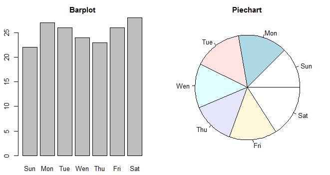
It takes in a vector of form c(m, n) which divides the given plot into m*n array of subplots. For example, if we need to plot two graphs side by side, we would have m=1 and n=2. Following example illustrates this.
# sample data for max.temp vector
max.temp <- c(Sun = 22, Mon = 27, Tue = 26, Wen = 24, Thu = 23, Fri = 26, Sat = 28)

# create a new plotting window and set the plotting area into a 1*2 array
par(mfrow = c(1, 2))

# plot a bar chart for max.temp
barplot(max.temp, main = "Barplot", names.arg = names(max.temp))

# plot a pie chart for max.temp
pie(max.temp, main = "Piechart", radius = 1, labels = names(max.temp))

This same phenomenon can be achieved with the graphical parameter mfcol.
The only difference between the two is that, mfrow fills in the subplot region row wise while mfcol fills it column wise.
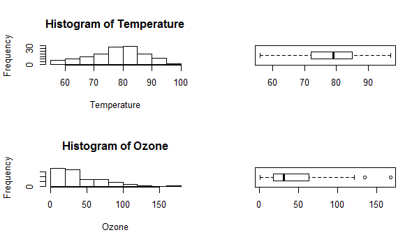
# extracting Temperature and Ozone data from the airquality dataset
Temperature <- airquality$Temp
Ozone <- airquality$Ozone
# create a new plotting window and set the plotting area into a 2*2 array
par(mfrow=c(2,2))
# Plot 1: Histogram for Temperature
hist(Temperature)
# Plot 2: Horizontal boxplot for Temperature
boxplot(Temperature, horizontal=TRUE)
# Plot 3: Histogram for Ozone
hist(Ozone)
# Plot 4: Horizontal boxplot for Ozone
boxplot(Ozone, horizontal=TRUE)

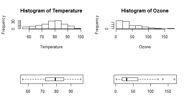
Same plot with the change par(mfcol = c(2, 2)) would look as follows. Note that only the ordering of the subplot is different.

More Precise Control
The graphical parameter fig lets us control the location of a figure precisely in a plot.
We need to provide the coordinates in a normalized form as c(x1, x2, y1, y2). For example, the whole plot area would be c(0, 1, 0, 1) with (x1, y1) = (0, 0) being the lower-left corner and (x2, y2) = (1, 1) being the upper-right corner.
Note: we have used parameters cex to decrease the size of labels and mai to define margins.
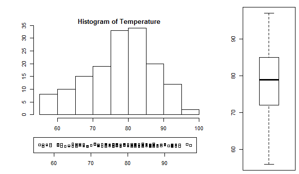
# make labels and margins smaller
par(cex=0.7, mai=c(0.1,0.1,0.2,0.1))
Temperature <- airquality$Temp
# define area for the histogram
par(fig=c(0.1,0.7,0.3,0.9))
hist(Temperature)
# define area for the boxplot
par(fig=c(0.8,1,0,1), new=TRUE)
boxplot(Temperature)
# define area for the stripchart
par(fig=c(0.1,0.67,0.1,0.25), new=TRUE)
stripchart(Temperature, method="jitter")
The numbers assigned to fig were arrived at with a hit-and-trial method to achieve the best looking plot.
